This is the method to plot all objects of class performance.
# S4 method for class 'performance,missing'
plot(
  x,
  y,
  ...,
  avg = "none",
  spread.estimate = "none",
  spread.scale = 1,
  show.spread.at = c(),
  colorize = FALSE,
  colorize.palette = rev(rainbow(256, start = 0, end = 4/6)),
  colorkey = colorize,
  colorkey.relwidth = 0.25,
  colorkey.pos = "right",
  print.cutoffs.at = c(),
  cutoff.label.function = function(x) {
     round(x, 2)
 },
  downsampling = 0,
  add = FALSE
)

# S3 method for class 'performance'
plot(...)
Arguments
- x
an object of class
performance- y
not used
- ...
Optional graphical parameters to adjust different components of the performance plot. Parameters are directed to their target component by prefixing them with the name of the component (
component.parameter, e.g.text.cex). The following components are available:xaxis,yaxis,coloraxis,box(around the plotting region),points,text,plotCI(error bars),boxplot. The names of these components are influenced by the R functions that are used to create them. Thus,par(component)can be used to see which parameters are available for a given component (with the expection of the three axes; usepar(axis)here). To adjust the canvas or the performance curve(s), the standardplotparameters can be used without any prefix.- avg
If the performance object describes several curves (from cross-validation runs or bootstrap evaluations of one particular method), the curves from each of the runs can be averaged. Allowed values are
none(plot all curves separately),horizontal(horizontal averaging),vertical(vertical averaging), andthreshold(threshold (=cutoff) averaging). Note that while threshold averaging is always feasible, vertical and horizontal averaging are not well-defined if the graph cannot be represented as a function x->y and y->x, respectively.- spread.estimate
When curve averaging is enabled, the variation around the average curve can be visualized as standard error bars (
stderror), standard deviation bars (stddev), or by using box plots (boxplot). Note that the functionplotCI, which is used internally by ROCR to draw error bars, might raise a warning if the spread of the curves at certain positions is 0.- spread.scale
For
stderrororstddev, this is a scalar factor to be multiplied with the length of the standard error/deviation bar. For example, under normal assumptions,spread.scale=2can be used to get approximate 95% confidence intervals.- show.spread.at
For vertical averaging, this vector determines the x positions for which the spread estimates should be visualized. In contrast, for horizontal and threshold averaging, the y positions and cutoffs are determined, respectively. By default, spread estimates are shown at 11 equally spaced positions.
- colorize
This logical determines whether the curve(s) should be colorized according to cutoff.
- colorize.palette
If curve colorizing is enabled, this determines the color palette onto which the cutoff range is mapped.
- colorkey
If true, a color key is drawn into the 4% border region (default of
par(xaxs)andpar(yaxs)) of the plot. The color key visualizes the mapping from cutoffs to colors.- colorkey.relwidth
Scalar between 0 and 1 that determines the fraction of the 4% border region that is occupied by the colorkey.
- colorkey.pos
Determines if the colorkey is drawn vertically at the
rightside, or horizontally at thetopof the plot.- print.cutoffs.at
This vector specifies the cutoffs which should be printed as text along the curve at the corresponding curve positions.
- cutoff.label.function
By default, cutoff annotations along the curve or at the color key are rounded to two decimal places before printing. Using a custom
cutoff.label.function, any other transformation can be performed on the cutoffs instead (e.g. rounding with different precision or taking the logarithm).- downsampling
ROCR can efficiently compute most performance measures even for data sets with millions of elements. However, plotting of large data sets can be slow and lead to PS/PDF documents of considerable size. In that case, performance curves that are indistinguishable from the original can be obtained by using only a fraction of the computed performance values. Values for downsampling between 0 and 1 indicate the fraction of the original data set size to which the performance object should be downsampled, integers above 1 are interpreted as the actual number of performance values to which the curve(s) should be downsampled.
- add
If
TRUE, the curve(s) is/are added to an already existing plot; otherwise a new plot is drawn.
References
A detailed list of references can be found on the ROCR homepage at https://ipa-tys.github.io/ROCR/.
See also
Examples
# plotting a ROC curve:
library(ROCR)
data(ROCR.simple)
pred <- prediction( ROCR.simple$predictions, ROCR.simple$labels )
pred
#> A prediction instance
#> with 200 data points
perf <- performance( pred, "tpr", "fpr" )
perf
#> A performance instance
#> 'False positive rate' vs. 'True positive rate' (alpha: 'Cutoff')
#> with 201 data points
plot( perf )
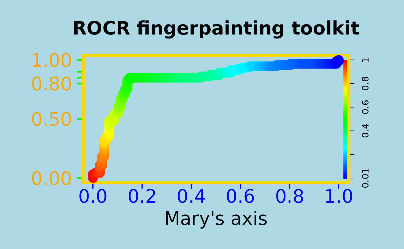
 # To entertain your children, make your plots nicer
# using ROCR's flexible parameter passing mechanisms
# (much cheaper than a finger painting set)
par(bg="lightblue", mai=c(1.2,1.5,1,1))
plot(perf, main="ROCR fingerpainting toolkit", colorize=TRUE,
xlab="Mary's axis", ylab="", box.lty=7, box.lwd=5,
box.col="gold", lwd=17, colorkey.relwidth=0.5, xaxis.cex.axis=2,
xaxis.col='blue', xaxis.col.axis="blue", yaxis.col='green', yaxis.cex.axis=2,
yaxis.at=c(0,0.5,0.8,0.85,0.9,1), yaxis.las=1, xaxis.lwd=2, yaxis.lwd=3,
yaxis.col.axis="orange", cex.lab=2, cex.main=2)
# To entertain your children, make your plots nicer
# using ROCR's flexible parameter passing mechanisms
# (much cheaper than a finger painting set)
par(bg="lightblue", mai=c(1.2,1.5,1,1))
plot(perf, main="ROCR fingerpainting toolkit", colorize=TRUE,
xlab="Mary's axis", ylab="", box.lty=7, box.lwd=5,
box.col="gold", lwd=17, colorkey.relwidth=0.5, xaxis.cex.axis=2,
xaxis.col='blue', xaxis.col.axis="blue", yaxis.col='green', yaxis.cex.axis=2,
yaxis.at=c(0,0.5,0.8,0.85,0.9,1), yaxis.las=1, xaxis.lwd=2, yaxis.lwd=3,
yaxis.col.axis="orange", cex.lab=2, cex.main=2)